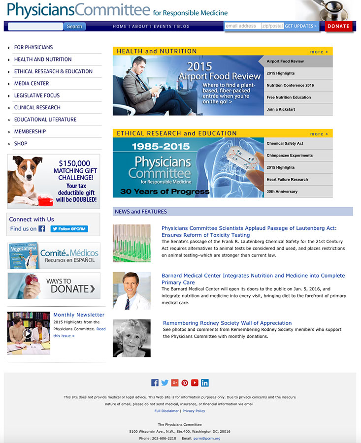
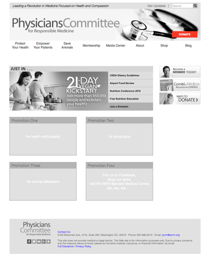
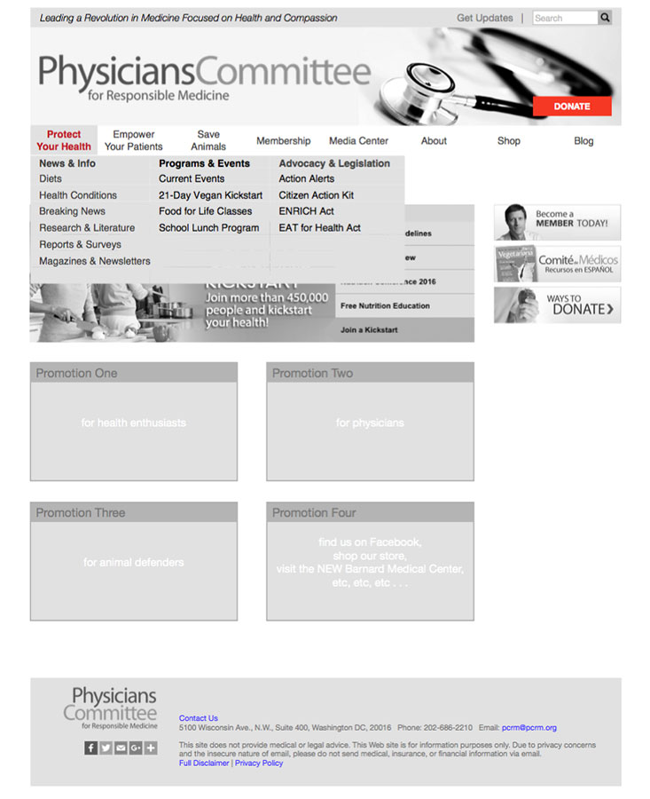
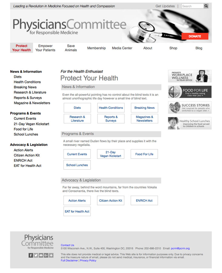
Project at a Glance

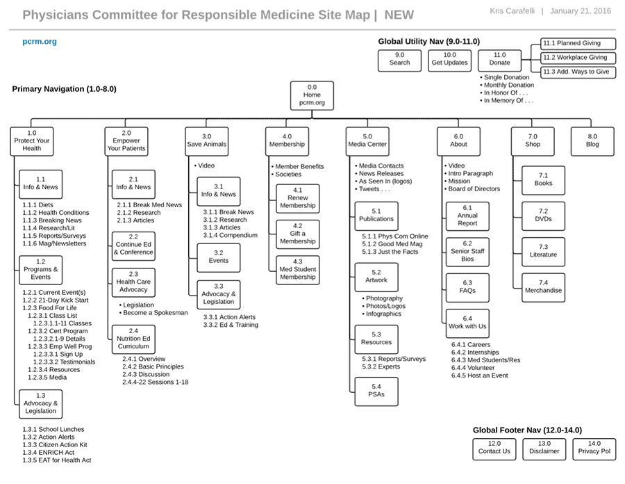
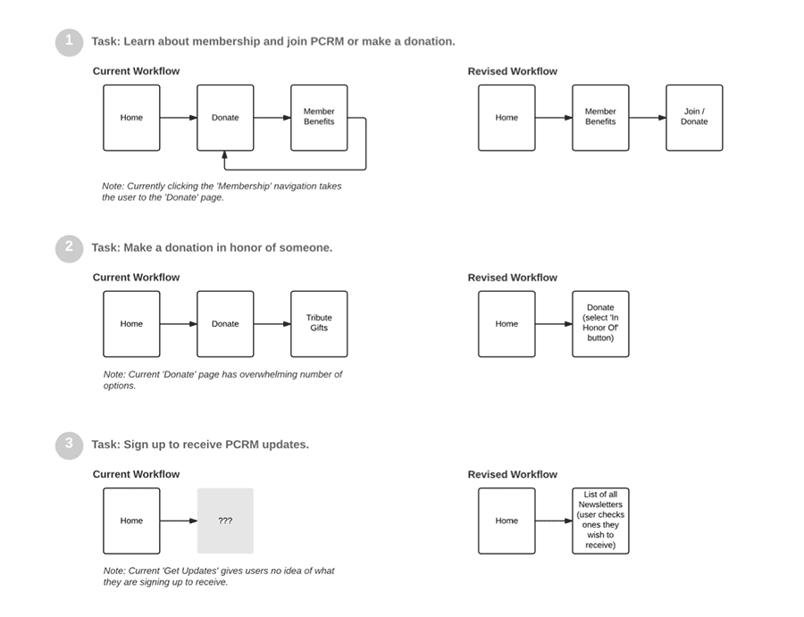
I redesigned the information architecture for PCRM’s website so it adheres to best practices and makes content more accessible. I began by identifying target user groups and developing business and design goals. Next, I conducted a content audit and restructured the content. Finally, I redesigned workflows and navigation and created wireframes.

Business Problem & Goals

The Physicians Committee for Responsible Medicine’s website has outgrown its current information architecture. This vast resource could be made more valuable to users — and instill more trust in the non-profit — with the ability to navigate a well-organized and updated site. Redesign business goals include:

  • Increase revenue through donations, membership and sales
  • Increasing program participants and franchise owners
  • Increase physician use of the education curriculum

Identifying the Users

I used PCRM’s stated priorities on their About Us page and my content audit to identify three primary user groups:


Health Enthusiasts

People interested in improving their health with a whole foods, plant-based diet and/or interested in Food for Life certification.


Animal Defenders

People opposed to animal testing and medical students determined to stop animal experiments at their schools.


Physicians

Physicians motivated to incorporate more prevention and education into their practices with the Nutrition Education Curriculum.

Top Three Design Goals

  1. Fix navigation/hierarchy issues giving users a sense of place and adhere to best practices
  2. Increase credibility and trust via well-structured content
  3. Restructure content to more effectively communicate to PCRM’s three primary user groups

Note: The Physicians Committee for Responsible Medicine was not involved with this project. All of the content, recommendations and ideas in this case study are mine.

Home Page | Before

Problem: The primary and global navigation is split between the top navigation bar and the left side bar making it difficult to add additional levels of navigation to the site.

Home Page | Redesigned

Solution: Primary and global navigation consolidated into the top banner. Site structure optimized for primary users: Health Enthusiasts, Physicians and Animal Defenders. Secondary user group: Media.

Home Page | Mega Menu

Solution: Secondary navigation appears in drop down mega menu which supports grouping — a good choice for content-rich sites.

Category Page | Redesigned

Solution: Cue in primary navigation lets users know where they are in the site. Secondary navigation is in left side bar giving users quick access to other areas of site.

Food for Life Landing Page | Before

Problem: Primary and secondary navigation disappear to reveal tertiary, Food for Life-centric navigation in left side bar. Quaternary navigation appears in the right side bar. Users are without a clear sense of place.

Food for Life Landing Page | Redesigned

Solution: Secondary through quinary navigation are consolidated into left side bar with cues giving users a sense of place even when deep in the site. Right side bar can now be used to promote content higher in hierarchy.

Membership Page | Before

Problem: Primary navigation disappears and the only way to return to site is the browser back button. Overwhelming number of options in right side bar and many are donation specific. Red button is both a button and a header for the two items immediately below it.

Membership Page | Redesigned

Solution: Membership options such as renewing or gifting a membership and membership benefits are separated from ways to donate and listed in left side bar. Right side bar can now be used to promote content higher in the hierarchy.

Donate Page | Before

Problem: Primary navigation disappears and the only way to return to the site is the browser back button. Overwhelming number of options in the right side bar including membership specific options.

Donate Page | Redesigned

Solution: Consolidate donation options on the page by using radio buttons and form fields. Use secondary and tertiary navigation in left side bar to group additional ways to donate. Membership specific options moved to membership page.

Content Audit / Site Map | Before

As part of the content audit and to get a feel for the scope of the site, I created a site map of the current structure. It took three pages.

Site Map | Redesigned

Restructuring the content for PCRM’s three primary user groups and greatly simplifying the membership, donation and program sections reduced the site’s overall complexity.

Task Workflows | Redesigned

Redesigned task workflows for learning about membership, making a donation and signing up for updates maximize efficiency and reduce user confusion.